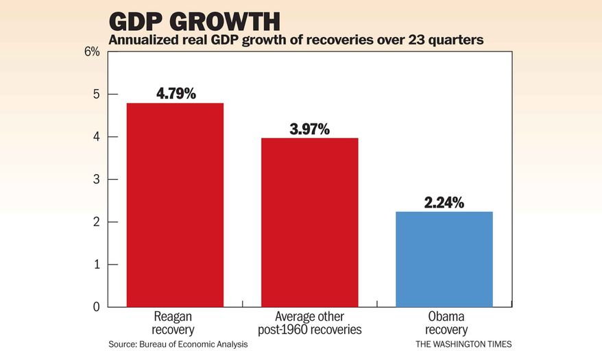
Since GDP comparisons were used, this should provide some perspecitve:
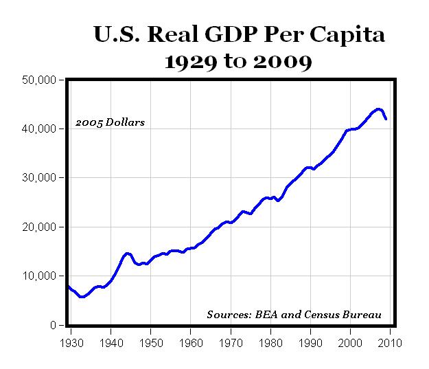
From a GDP perspective, this represents historical data, so you can see what GDP looks like going into the respective terms. The downturn going into 2009 is rivaled only by the Great Depression and WWII. It wouldn't appear as if Reagan faced anything close to the downturn that was happening in 2008-2009.
I mean, if we are being impartial and honest about data ... Ford(R) 74-77, Carter (D) 77-81, Reagan (R) 81-89, Bush(R) 89-93, Clinton (D) 93-2001, Bush (R) 2001-2009, Obama (D) 2009-present. I'll see if I can find something that extends to today.